Building the Future
Building a brand isn’t just about a town sign, a logo on a wall, or a flag above a building. It’s about building the future.
A great brand will create more opportunities and inspire the future.
If we shoot for the stars, what’s the best Colfax we can imagine?
A flourishing Quarry Springs Park. A Skunk River Water Trail paddle/float destination. More retail. More food and drink. More businesses. More residents.
Our goal is to build a brand that will help Colfax continue its ascent.
Winter on the Skunk River
THE LOGO
The logo is a symbolic representation of the city of Colfax. In the design, the name of the city is literally on a hill above the river and the springs.
Utilizing the unchanging features of the city (the hill, the river, mineral springs history) gives the logo lasting value, as does the decision to represent these things symbolically with a classic design, rather than overly stylized graphics that can quickly become dated.
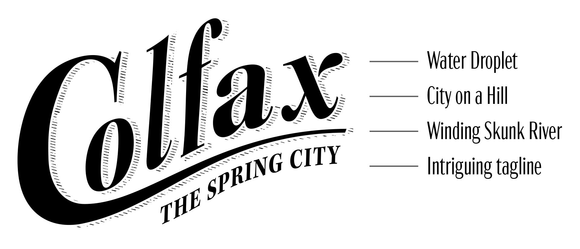
Water Droplet
We stylized the “x” to create a subtle water droplet design that represents the city’s deep connection to water—the mineral springs history and the Quarry Springs Park future.
City on a Hill
The upward slope of the logo represents the city’s topography—a unique, distinguishing feature (especially in flat Central Iowa) that adds to its beauty. This is also in line with a historic design style that has retained its contemporary appeal throughout the ages.
Winding Skunk River
The tail on the “C” ties the design together while also representing the Skunk River that flows through.
Intriguing Tagline
Not only does the tagline invite you into the city’s world-famous past, but also points you to the future with Quarry Springs Park. And we love that it isn’t pulled out of thin air. Once upon a time, Colfax was known as The Spring City.
Typeface
We designed a custom, classic typeface (based on Kepler) that is inspired by historic mineral springs advertising.
Simple & Versatile
The logo’s simplicity and versatility makes it easy to use in lots of ways (i.e., embroidery, screenprinting, signage, etc.).
Hatching
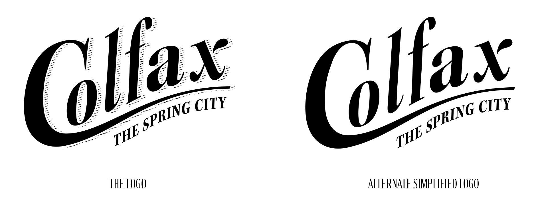
While the logo can be used with or without hatching (the shading around the large type), the hatching adds more personality (and is both classic and on-trend with current design).
Brand Standards
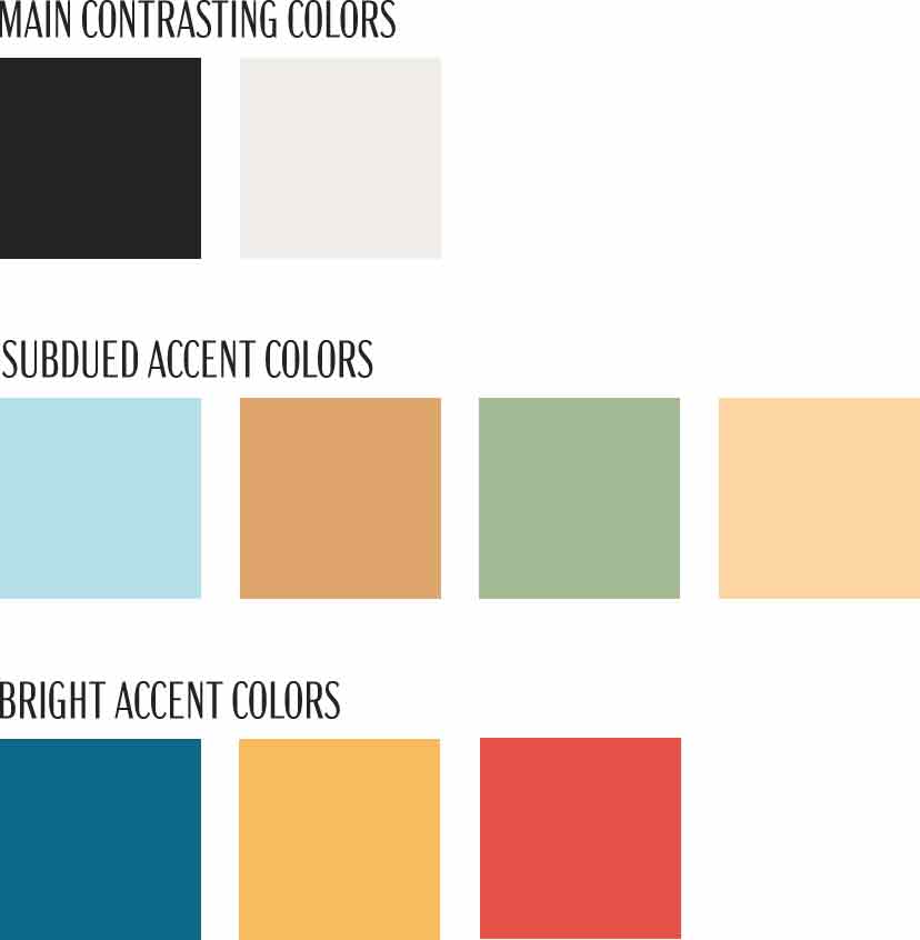
Color Palette
It’s important to have a flexible color palette so your logo can be presented well wherever needed. The logo can be a classic black and white or any of these other colors depending on needs.
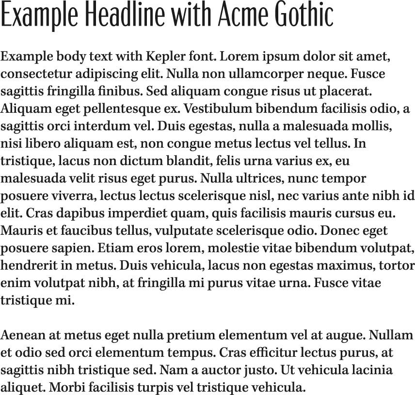
Typography – Kepler & Acme Gothic.
The Kepler typeface has 172 font variations making it an extremely high quality typeface with an array of options. Serif fonts are known to be more readable than sans-serif fonts when used for large sections of text. This makes it ideal for body text. It’s also a good match to our logo typeface. Acme Gothic compressed font provides a sans-serif contrast that will stand out when used for headlines (e.g., on the website). While sans-serif fonts are typically considered more modern, this one contains a vintage style reminiscent of Colfax Mineral Water Co. advertising.
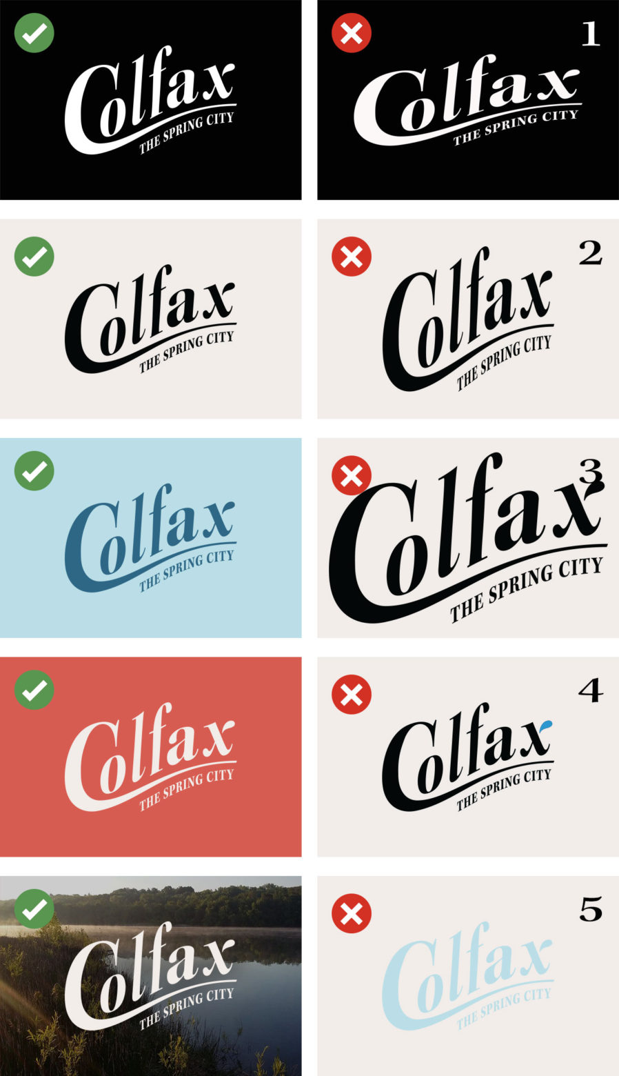
Logo Do’s and Don’ts
Do
– Use the logo in it’s original aspect ratio.
– Use negative space around the logo.
– Use the logo in a single color that contrasts the background.
– Use the logo in black, white, off-white, bright accent blue, or one of the other brand colors.
– Use the logo in white or black over photos.
– Use brand colors for logo and background.
Don’t
– Don’t squeeze or stretch the logo. #1, #2
– Don’t push the logo against the edges of its containing element. #3
– Don’t use multiple colors in the logo. #4
– Don’t use a color that does not contrast the background. #5
– Don’t use colors that are not on the brand color pallete.
The Alternate Crest Logo
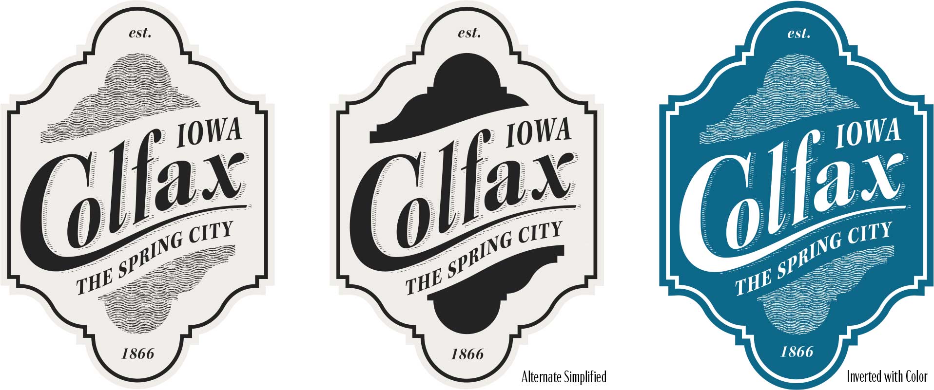
The Shape
Inspired by the Hotel Colfax facade and historic bottle labels, we created a unique crest shape that you won’t find anywhere else in the world. This shape has the potential to be utilized in other ways (e.g., signage, website wallpaper, apparel).

State & Date
We added “Iowa” to the design as well as the founding year, which builds historic credibility.
Interior Shape
The interior shape is a repeated pattern of the facade/bottle label design and can be used as a solid color or as wavy lines reminiscent of flowing water.
The Seal
The gazebo at Mineral Springs Park is one of the most recognizable and cherished structures in downtown Colfax. We utilized this long standing landmark along with other brand-unifying elements to create the city seal. The text makes use of the Kepler typeface. The wavy texture ties in the alternate crest logo. The wave in the background uses the same curve found in the Colfax logo and flag that symbolize the hill Colfax is built on and creates continuity across all design elements.
